Álex Fernández
Data Analyst & BI Developer
In this space, you can find some insights regarding my projects, as well as some written analytical pieces.
Linkedin | Twitter | Blog
Building an Analytical Scouting Model based on Algorithms and Advanced Metrics

- GO TO THE STREAMLIT APP -v2.0-
- GO TO GITHUB REPO -version 1.0-
-
GO TO THE VIDEO PRESENTATION ON YOUTUBE (in Spanish) -version 1.0-
- Disclaimer: This model, including the app build-up, is entirely written in Python. You can check out the code line by line on the Github Repo
The purpose of this project is to develop a model that, when deployed on an app, will segmentate players in the world’s most important football competitions according to advanced metrics. By taking into account the game model of teams, the model will link each club to the type of player who, given their position on the field, best fits into their game model. The value of the model lies in adding the team’s style of play - both their own and that of their opponents - as a key factor, measuring and quantifying it to identify those players who are closest, based on advanced metrics, to the numbers of the team being analyzed. These footballers will potentially be the best fit for the needs of the team going to the market, as they will require a shorter adaptation process and will know similar game mechanisms, since they come from teams that show tactical similarities.

Data coming from
This application employs an analytical model to segment the characteristics of players in football competitions within the potential market of the study, using advanced metrics. By considering the playing style of teams, the application can associate the players who best fit their approach for each position on the field. The algorithm quantifies and aggregates the playing style of teams to then profile each player in a specific position based on the key metrics of each role. Thus, it is possible to identify, empirically and with a completely data-oriented approach but with a clear intention of contextualization, those players who are most suitable for the desired role in a particular team and tactical context.
The players returned by the model will have more suitable conditions to meet the team’s needs when entering the market. Therefore, they will require a shorter adaptation process and will be familiar with similar playing mechanisms, having belonged to teams that exhibit comparable patterns in their playing style.
Throughout this manual, we will attempt to explain the functioning and logic of the app, highlighting its main features.
It is worth noting that, for a better visualization of the interface, it is recommended to decrease the zoom level of the web browser to 80-90% on this page. Additionally, while access on mobile devices and tablets is entirely possible, the interaction with the app is significantly enhanced when using a computer.
Source Data
The app is set up based on aggregated player and team data from the 2022/2023 season, extracted from the specialized portal WyScout. Below is the set of competitions included in the model and visible in the interface.
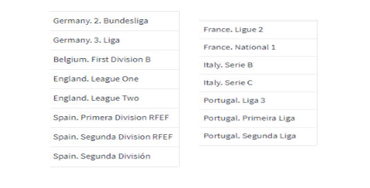
If necessary, it would be possible to expand the set of included leagues by adding other competitions that the data provider includes.
Methodology
The model has a significant strength compared to those typically published in the past, as it takes into account the playing style of the teams it evaluates. The final recommendation for a player in a particular position not only considers variables of similarity between players but also the playing style of the teams in which all analyzed players play. To model this, the proposal of teams is distinguished through the analysis of four categories:
- Tactical Setup: Organization and System
- Defense: Pressure, width, and height
- Buildup: Ball distribution, pace, combinations in the opponent’s half, width with the ball, attitude after recovery.
- Opportunity Generation: Origin of the ball when it reaches the area, yield according to the type of attack (positional vs. counterattack vs. set pieces)
Each mentioned category will be assigned variables that relate more closely to what each of them values. In the second phase, as we will see later, the model will choose, from the set of provided variables, a smaller number of them—or a mix, sometimes—that can, on their own, establish subgroups within the category and explain them in a meaningful way.
In the case of players, the model distinguishes between six main positions, with some of these positions having several specific roles:
- Goalkeepers (POR)
- Center Backs (DFC)
- Fullbacks
- Right Backs (LD)
- Left Backs (LI)
- Midfielders
- Defensive Midfielders (MCD)
- Central Midfielders (in three-midfield systems) or second midfielder in a two-men-formation such as 4-2-3-1 or 4-4-2 (MC)
- Offensive Midfielders
- Attacking Midfielders (MCO)
- Right Wingers (ED)
- Left Wingers (EI)
- Forwards (DC)
Similar to evaluating team play, each of the mentioned main positions will be assigned key variables to explain both performance and role differentiation. For example, defensive standard metrics—those related to duels, interceptions, tackles, etc.—will carry more weight for defenders and pivots than in other cases. Similarly, metrics like xG will barely influence the definition of center-backs but are crucial for evaluating and classifying almost any player participating in the attack, including fullbacks.
The model will take the defined metrics and determine which ones are most important in explaining the different profiles within each position. Additionally, based on the presented numbers, it will assign a role to each player for each position.
The described methodology allows the analyst of the coaching staff to interpret why a player/team has been labeled in a certain way. They can visualize in the application the weight that each metric has had in this process. Furthermore, it is even possible to modify the inclusion criteria of variables, allowing for the redesign of the model based on the playing style of the team that will use it—for example, a team playing direct football may prefer metrics associated with receiving long balls or heading accuracy after a lateral cross to weigh more in the assessment of attackers than other metrics such as dribbling success, passes to the final third, or expected assists.
App Features
At this point, we will navigate through the interface, explaining the logic of the visualizations it provides and how the results of the implementing model are explained.
First and foremost, we must recall the main objective of this app: given a specific team/playing style and a position on the field, it will return a list of players who are most suitable/compatible to play in that position under the playing style of the marked team.
Filters Area
The first thing to note is the filters bar, located on the left (which can be expanded or collapsed to facilitate the visualization of the analytical part of the app). In this bar, we have two key indicators to cover for the model to start working:
- Position on the field for which we will perform the search.
- Team from which we want to obtain information.
In addition to these two key parameters, there are two fields related to the methodology that the model will apply to obtain information, and by default, they are unchecked. Under default conditions—without marking any of these fields—the app will act as described above in bold—take the playing style of our team and return players from that position who fit its parameters.
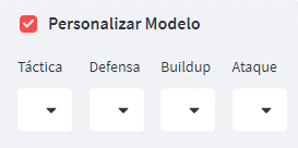
If we check the “Customize Model” option, we will be allowed to set, as desired, a label for each phase of the game in our team. This procedure would be useful for teams that, for example, know they are going to modify their playing style with the arrival of a new coach compared to what is in the data. In that case, they can “design” the conditions of their new playing style by providing parameters in that option.
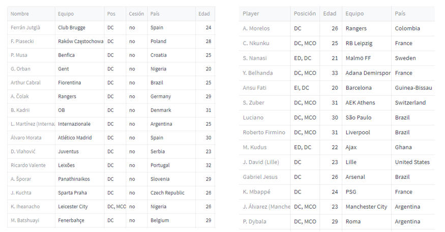
If we select the option “Show players similar to a reference XX,” the model, instead of considering the playing style of teams, will exclusively rely on similarities between players. This feature will be useful in cases where a team decides to replace a player by seeking a copy that closely resembles the outgoing player. For instance, if Real Madrid loses Karim Benzema and is determined to replace him with the closest possible match, activating this function would eliminate the “noise” caused by matching based on playing style similarity. It wouldn’t return exact copies of players but rather those who best fit considering the team’s formation and the other pieces in place under Carlo Ancelotti. As an interesting note, on the left, we display the 15 forwards most suitable for Real Madrid’s model (unchecked checkbox), and on the right, what would be returned if we activate this option—the 15 players most similar to Benzema according to the data.
We’ll leave both options unchecked to make the original model work, which is generally the one that should be used more often. Let’s continue reviewing the input variables.
The “Q” parameter determines the number of players the model will return, while the ones listed below will be used to restrict or expand certain parameters of the players. They are as follows:
- Market Value (Transfermarkt): Limited, by default, to a maximum of €10 million.
- Age: Limited by default to a maximum of 30 years.
- Minutes Played: Limited by default to a minimum of 800. The model only considers players who have played at least 15% of the minutes in their league during the 22/23 season or more than 500 minutes.
- Preferred Foot
- Preferred Profile: This category is important if we want to search for players belonging to a position but need to identify a very specific profile. An illustrative example would be Arsenal or Real Sociedad looking for players to fill the roles that Martin Ødegaard and David Silva played in those teams, respectively. They will need to specify that they are looking for an interior who is not only left-footed but is also accustomed to playing on the right side.
- Years Until End of Contract (no default limitation): allows the model to only return players with a maximum of X remaining years on their current club contract.
- League Selection: allows modifying the criteria for selecting the leagues whose players will appear in the app. Additionally, even while maintaining the default criterion, you can exclude a particular league.
Model Results
Once the criteria of operation are specified, the model will primarily return a list of players who, taking into account the set filters, most closely resemble the playing style of the teams. Additionally, it provides key information for the user to interpret the results. Before discussing that table, let’s analyze the two tables above.

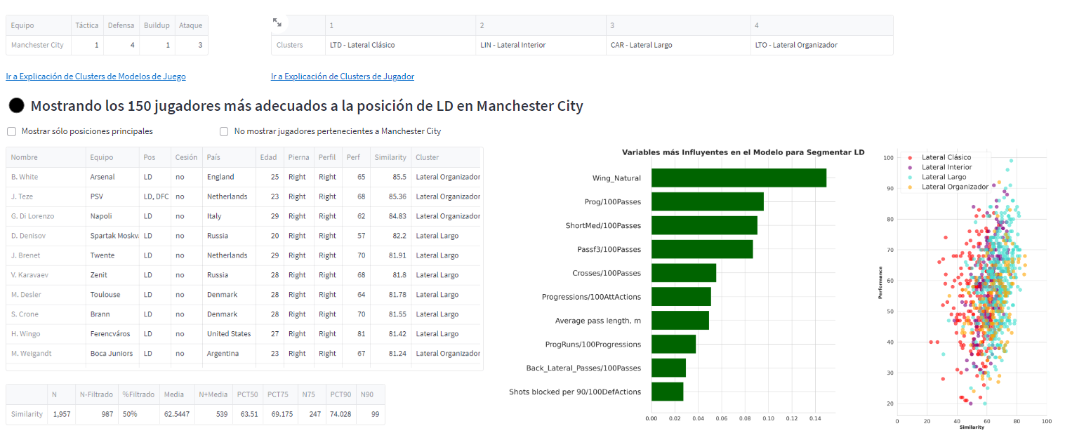
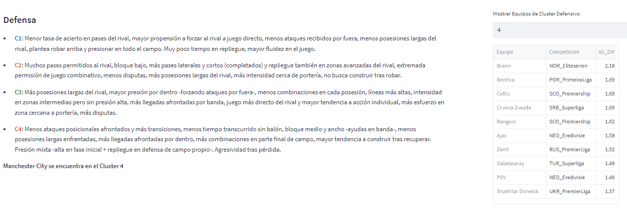
The above table indicates how the model has classified our team for the four analyzed phases of the game. To understand the results, you simply need to click on “Go to Explanation of Game Model Clusters.” This will take you to an area where the meaning of each profiling is explained, which teams are in each category, or what some of the key variables are to explain these results. For example, in the case of Racing, we see that, in Defense, the team is labeled in cluster 4. By navigating to the description, we get an explanation that helps contextualize it, and we can see the behavior of the cluster, for certain key metrics, compared to the rest of the groups.
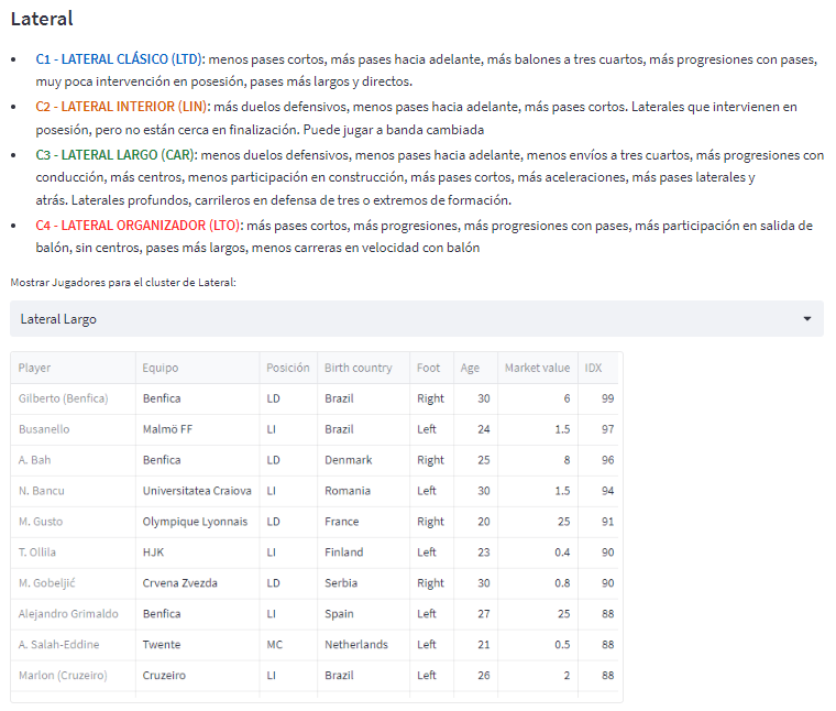
Something similar can be found in the case of players. The table on the top right shows the existing roles, according to the model, for the specified position—in this case, for the fullback. These roles essentially describe the player’s style of play or the function the player performs when playing in that position. By clicking on the Explanation, we will see the explanation of each role and a set of players that the procedure has identified as belonging to that group.
The players table defines, therefore, those players who have the greatest similarity in their game to the selected team’s model. This table presents, in addition to the basic player data, three key variables:
-
Similarity: This is the most important metric in the context of this project, as it effectively measures how closely the player aligns with our playing style. A 100 in this metric would show a perfect match—though for obvious reasons, this indicator will never be that high. In the table just below (purely indicative), we can see, among other indicators, the score that separates, for example, the top 10% of the most similar players from the rest (PCT90 column) and how many players meet that rule.
-
Perf (Performance): This is an indicator of the player’s level according to the data. A higher indicator means better performance in key metrics during the specified season.
-
Cluster: This defines the player’s role in that position. It is determined using the same metrics—which we will see below—that the model uses to calculate “Similarity.”
It should be noted that some players may appear in multiple different positions, depending on the number of minutes they have played in each position. As an example, we know that Quique Fornos will appear both if we evaluate central defenders—his natural position—and fullbacks—since he played many minutes as a right back in the last season.
Next to the table, we see two visualizations:
-
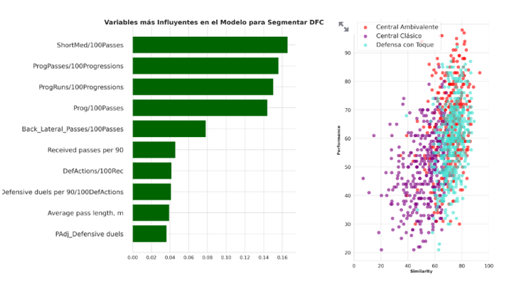
The first shows the most relevant variables for calculating the similarity score and the degree of influence they have held. Thus, variables related to ball progression, frequency of doing so, or propensity for duels are considered the most important for differentiating central defenders in this case.
-
The graph on the right provides an initial image of the role that the model associates as the most representative of the position in the club in question. Here, at a glance, we can see that, in the case of fullbacks, there is no role that clearly dominates, although the long fullback—which is the most offensive profile of all the roles classified—is slightly more favored.
Once we have obtained the results from the model and have an idea of the type of player being offered, we can proceed to analyze the profiles and players that the model has returned to us.
Dashboard
In this section of the interface, the most analytically profound visualizations are provided, allowing us to discern the characteristics and level of any recommended player and, additionally, make comparisons and/or seek alternatives. First, we observe a radar chart accompanied by a percentiles indicator. These two visualizations provide a detailed and exhaustive image of the strengths of the player, measuring those variables that are key to the position.
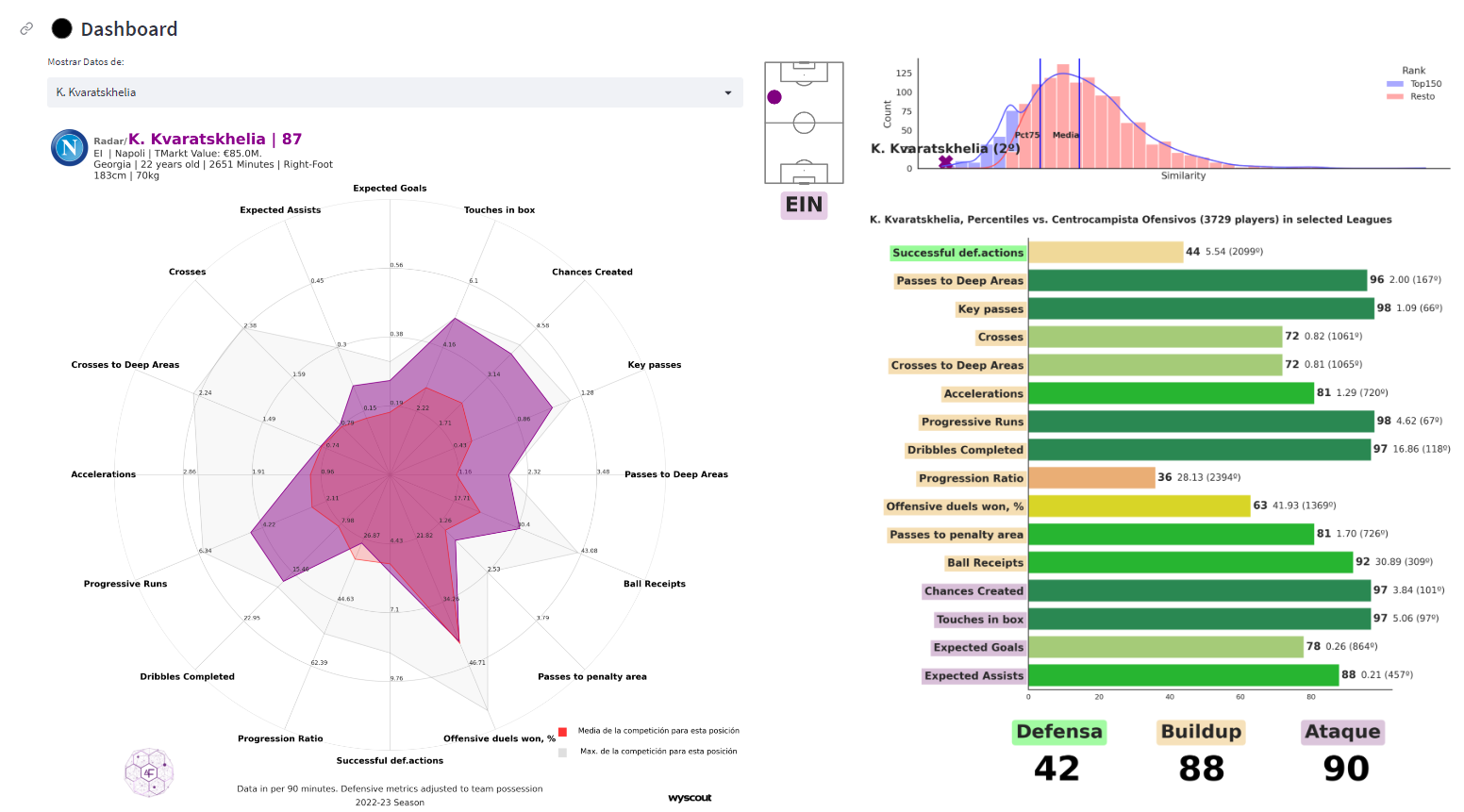
In the radar chart, the player—in this case, Kvicha Kvaratskhelia, in violet—is compared with the average left midfielder of Serie A. Additionally, a “mold,” colored in light gray, is shown, displaying the maximum values that left midfielders in Italian football achieved during the season. On the right, the percentile chart contextualizes the player by measuring them against the rest of the players in the main position across any league, indicating, for each metric, their proximity to the best possible score. Holding a 97th percentile in completed dribbles, as in the example here, implies that the player surpasses 97% of players in the model in that statistic. In this chart, for example, the Georgian player is being compared not only against left midfielders but also against attacking midfielders and right wingers. Below, as we see, a score is established, out of 99, for the player based on the level shown in the evaluated variables. Green-colored metrics are considered defensive, orange ones are related to construction, and purple ones are offensive.
The second part of this section allows for the comparison of the player that we have discovered, thanks to the model, in the initial zone and that we have analyzed using the radar and the percentile chart. Let’s assume we are conducting the analysis in the context of Manchester City.
The tool allows us, within the same radar, to check the metrics of the analyzed player—keeping Kvaratskhelia—and measure them against the player currently playing the same position in the team, namely Jack Grealish. We can perform the same comparison using the tornado chart just below, which compares the percentiles recorded by both players. As above, the score that each player obtains in each game category is presented.

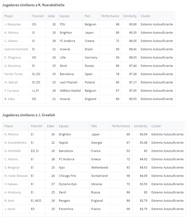
In addition to the above, the user can measure the degree of similarity of the player being analyzed with the set of players already in the squad for the same position. Additionally, the model returns, on the right side of the zone, the players who most resemble both the player on the left of the radar and their comparison.
Context
The last point in the analytical zone allows the user to measure the player in question and compare them with the rest of the players in that position in an interactive and customized way. After selecting the two variables that are considered most appropriate for the comparison, a scatter plot will be displayed where elements will be positioned, and they will be differentiated by their role through the color of their label. At a glance, we can already discern that the role of “Self-Sufficient Winger” shows better numbers in the two default selected metrics—Key Passes and Completed Tackles in Deep Areas.
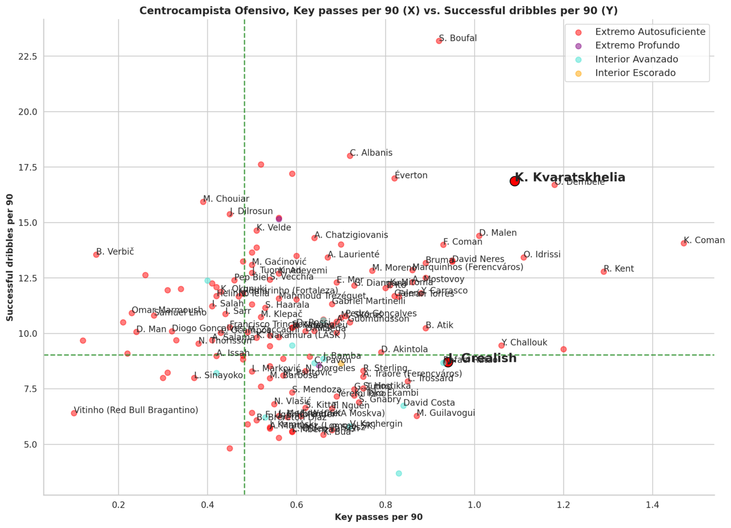
In the above image, we see the results obtained by defining two new variables—xG+xA (to measure the level of chances they create) and Completed Dribbles—seeing how offensive midfielders selected by the model for Manchester City behave under those measures.
We should understand that Kvaratskhelia (highlighted in bold as the player we are analyzing in the Dashboard) has extremely high numbers in successful dribbles—much more than Grealish or Foden and close to a specialist like Boufal—while he is slightly above average in terms of xG+xA, but far from players who normally do not play as wide and are closer to the goal, such as Donyell Malen or Pedro Gonçalves.
It should be noted that, as seen in the image, there are points on the graph that are not labeled. The reason is purely visual—if we put names to all the points, it will complicate their reading. Similarly, if we wish to increase the number of players indicated, it can be done through the horizontal bar next to the graph.